At a recent DataKind SF event, I was rather intrigued by the challenges faced in investigating wage theft and other labor violations not just throughout the nation, but also specific to California and the Bay Area regions. At first, and probably like a lot of you, I had little idea what “wage theft” and other labor violations really entailed. Upon some reading, and in correspondence with some very motivated domain experts from the Stanford Center for Integrated Facility Engineering and the San Francisco Dept. of Labor Wage and Hour Division, the extent and impact of this problem began to impress upon me. This NY Times article captures the gist of the issue well. Withholding overtime pay, paying below minimum wage, skimming wages off paychecks, violations against under-age workers (child labor!), visa abuse, etc. are all forms of theft and abuse that have a big impact to at-risk workers, their families, and make life harder than it already is.
The Wage and Hour Division (WHD) has done a nice job of summarizing some impact statistics around this problem. Meanwhile, the Department of Labor has put together a dataset of all known (investigated and closed) cases of violations nationwide at this D.O.L. Enforcement portal. The “Wage and Hour Compliance Action Data” is what I’ll be looking at, specifically.
Data Wrangling
For an explanation of the main Wage and Hour Compliance Action Data set , its contents, and additional data needed, I’ve written up a step by step guide of how I went about acquiring and manipulating data (link above). I’ve annotated this document as best as I can to explain the steps involved in getting and cleaning the data. The notebook above is broken down into 3 parts, along with all the Python code that goes with it. For those who aren’t interested in the code, here’s a brief breakdown of what’s going on (you can also follow along the notebook above and ignore the code chunks):
Part 1: DOL Wage and Hour Compliance Data
- Limit to California only for now
- Create violation type reference to violation group
- Create a non violator flag* for investigations that failed to uncover violations
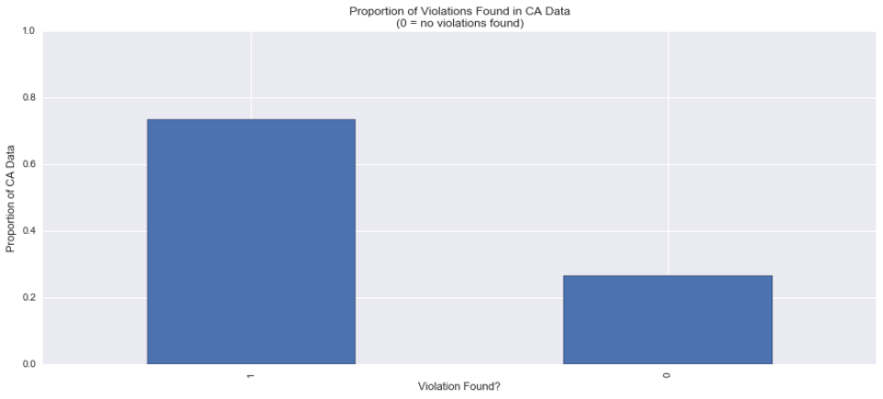
Proportion of warranted violations by investigation in DOL WHD California data - Extract 3 digit NAICS
*Update, 08/05/2016: I've since learned that it is not safe to assume
that no violations found (class = 0) suggests traits indicating model
employers. It might just be the case that these investigations were not
scrutinized well enough, amongst others. This seems to eliminate the
possibilities associated with possibly predicting something like a WHD
investigation payoff.
Part 2: Census Bureau’s Statistics of US Businesses (SUSB) Survey Data
- Get Census SUSB workforce employment statistics at the MSA level, by 3 digit NAICS
- Get zip codes by MSA
- Merge zip codes into the MSA dataset
Part 3: Combine Part 1 and Part 2
- Merge the two by zip code and 3 digit NAICS
- Aggregate numbers to the MSA level*
*Update, 08/05/2016: After this exercise we lose about half of violations
data from the main dataset because SUSB statistics fail to account for
estimates such as total workforce in an industry group for many MSAs. On
consulting with domain experts one possibility that arises is that this
lack of data might simply be because of undocumented workers that the
survey does not account for. This begins to restrict any analysis conducted
at this level.
We now have violation dataset with SUSB employment numbers at MSA level. Sample screenshot:

Exploring Violations
In the notebook above, I’ve engineered a few new features to measure the idea of severity of violations.
While we can look at things like the total Minimum Wage violations by MSA or by Industry, it might not be a true reflection of the real world as the D.O.L. is only able to investigate industries and areas based on anecdotal evidence. The data we see therefore, suffer from observation bias – we see more data around certain industries because those are investigated more, but this doesn’t necessarily entail that the other industries are exemplars of good conduct.
So let’s look at a few relationships and see how we can engineer some features with respect to something like investigative payoff. Ideally, industries and MSAs with violations that are considered to be severe deserve to be looked into more than the others. What we need, then, is a measure of Severity given the data at hand.
Let’s think of severe violators, for an industry group, in a Metropolitan Statistical Area as those industries that owe a high amount of backwages to a larger chunk of the total workforce. The local DOL WHD is concerned with these sorts of violations because it is likely that these affect larger numbers of at-risk populations:
Violation Severity = Backwages Owed * Proportion of Workforce Affected (by industry group, in that MSA)
Visualizing Violation Severity by Industry Groups and MSA
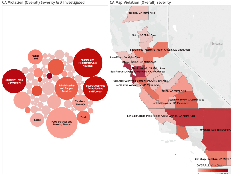
Here’s a Tableau workbook I put together to look at violations in California, by industry group and by MSA.
Left, bubble chart: This visualization of severity of violation tempered by the number of investigations conducted, helps us identify those industry groups in certain MSAs that have exhibited severe violations but might not have surfaced in the data as much. The size of the bubbles correspond to the number of cases of investigations conducted in those industries, whereas the severity of the color red indicates the severity of violation. The critical industries that the investigative body might want to look at are the smaller bubbles, that are deep red in color, indicating less oversight but severe violations in the past.
Right, CA map: A violation severity heatmap of California Metropolitan Statistical Areas. Thanks to the power of Tableau, I was even able to make the charts interactive: selecting an industry on the left will update the corresponding MSAs on the right.
This other Tableau workbook visualizes the same data, but broken down by the following violation types. On the top, the length of the bars indicate the severity of violations (sorted by overall violations), whereas the color indicates the number of investigations conducted. We see that “Computer and Electronic Product Manufacturing” has rather severe “Overall” violations, but hasn’t been investigated as much as, say, “Nursing and Residential Care” facilities.
Violation types (grouped):
- MW Vltn Svrty: Severity of Minimum Wage type violations
- BMW Vltn Svrty: Severity of Below Minimum Wage type violations
- CL Vltn Svrty: Severity of Child Labor type violations
- Other Vltn Svrty: Severity of all other types of violations
A data dictionary for all the column names is available at the DOL Enforcement site (‘whd_data_dictionary.csv’).
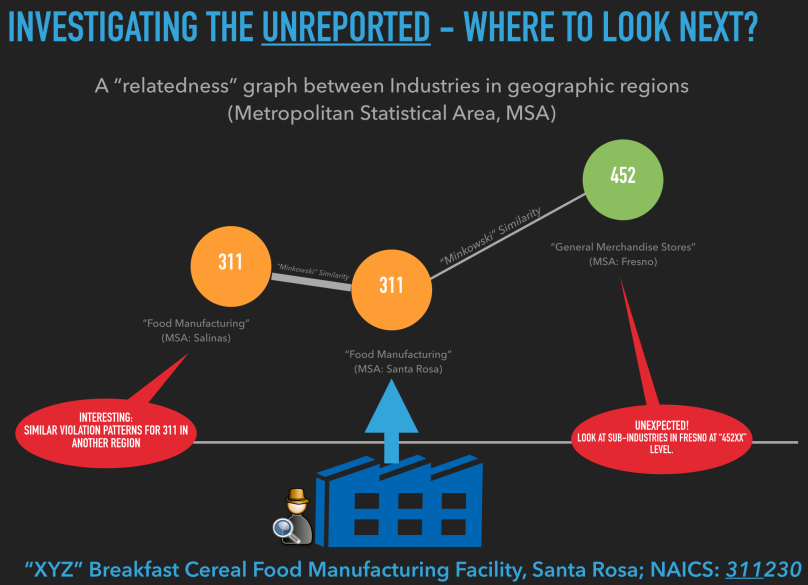
A Graph Based Visualization of Similarity of Violation Patterns (coming soon)
Supposing an investigator just got done investigating a firm that belongs to a certain granular NAICS designation (usually a 6 digit code). How might this investigator, or the WHD office in the MSA, or even at the state level, get an idea of similar violators in other industries, and even in different locations? Here’s what I mean:
D3.js inspired graph visualization of this idea coming soon.
02/04/2017: While I’ll eventually get around to hosting the visualization online, here’s a video demonstrating my visualization in action. Each node is an industry sector as represented by its 3 digit NAICS. The edge lengths are inversely proportional to how similar (closer = more similar) a sector is in terms of violation patterns to the sector that’s the focus of inquiry. Note: Credit to Mike Bostock’s Force Directed Graph and Fisheye Distortion d3.js templates that I’ve adapted for this viz.

Never too late! But I figured I’d at least put up a video of the visualization up above while I’ll eventually get around to hosting the d3.js code online.
LikeLike